Sales analysis from every angle, built from your ERP data
Every invoice line, by sales person, customer, item, category, area, region, country, range, group or type, with your target on the chart and no spreadsheets in sight.
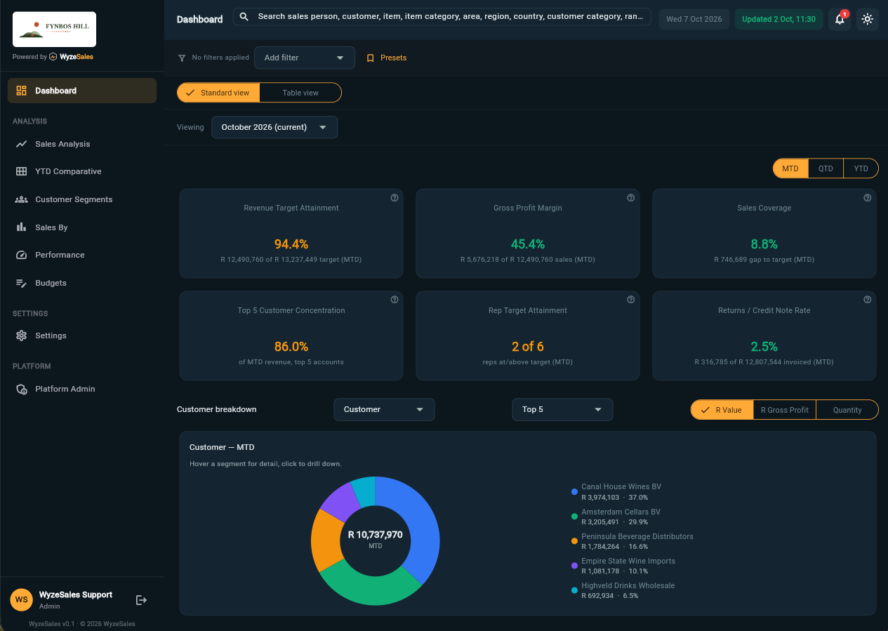
Chart or table, summary or invoice line
Start with the trend, then keep going until you are looking at the individual document. Switch between chart and table in a click, and see your target on the chart so you notice the gap as it opens.
- Every dimension you care aboutGroup and filter by any of the dimensions below, or combine several of them.
- Months or quartersIn rand value, gross profit or quantity.
- Compare side by sidePut sales people, customers or products next to each other on one chart.
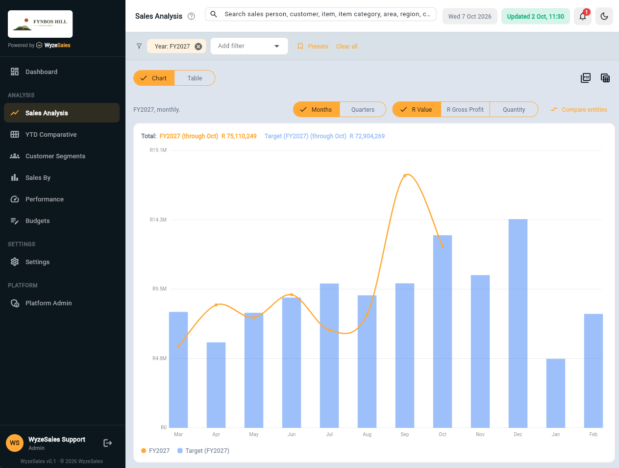
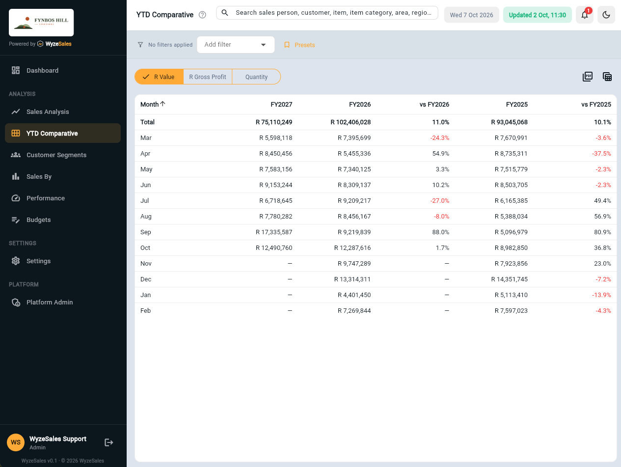
This year against the last two, month by month
See whether you are ahead of last year, and whether last year was itself a good one. Totals compare like for like months, so a part-finished year never looks like a collapse.
Group by any dimension, not just by month, and export to PDF or Excel when someone needs it in a pack.
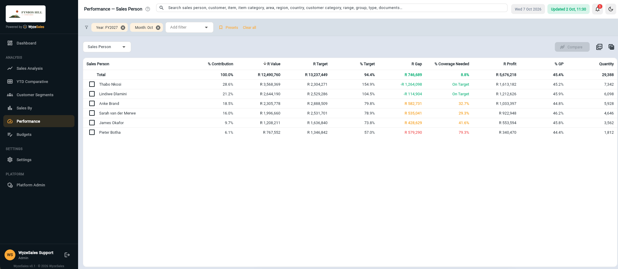
Know who is on target, and how far the others have to go
% of target, the rand gap, how much more coverage you still need, and gross profit, by sales person or any other dimension. Colour-coding shows who is on target, behind, or well behind.
The bell on every screen warns you when a customer, sales person or branch is selling at a loss, or running behind its pro-rated budget, before month end does.
Know which customers to thank, call and win back
Add customer segmentation to see who your best customers are and who is slipping away. Or see the whole 360° view.
Frequently asked questions
What is a 360° view of sales?
Which dimensions can I analyse by?
Can I compare against targets and last year?
How does my data get into WyzeSales?
Can I export what I see?
Let's talk about your business
Tell us what ERP or accounting system you run and what you would like to see. We will show you how it looks on real numbers.